고급 시각화, 데이터분석과 UX
다양한 시각화 기법
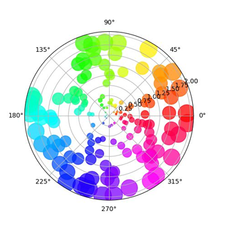
Polar Plot
극좌표계를 사용하는 시각화 거리(R)와 각(Theta)을 사용하여 plot 회전, 주기성 표현에 적합 Matplotlib에서 projection=’polar’ 옵션으로 사용 가능
np.random.seed(19680801)

N = 100
r = 2 * np.random.rand(N)
theta = 2 * np.pi * np.random.rand(N)
area = 200 * r**2
colors = theta

fig = plt.figure()
ax = fig.add_subplot(111, projection='polar')
c = ax.scatter(theta, r, c=colors, s=area, cmap='hsv', alpha=0.75)
plt.show()
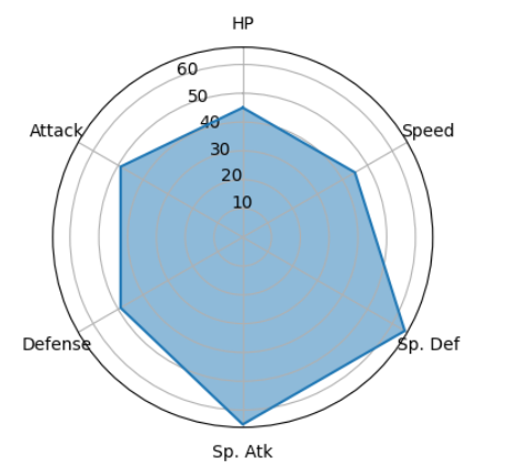
Radar Chart (Star Plot)
- 극좌표계를 사용하는 대표적인 차트
- 중심점을 기준으로 N개의 변수값 표현
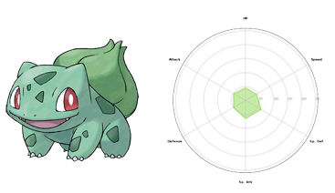
fig = plt.figure(figsize=(4, 4))
ax = fig.add_subplot(111, projection='polar')

values = pokemon.iloc[0][stats].to_list()
values.append(values[0])

ax.plot(theta, values)
ax.fill(theta, values, alpha=0.5)

ax.set_thetagrids([n*60 for n in range(6)], stats)
ax.set_theta_offset(np.pi/2)

plt.show()
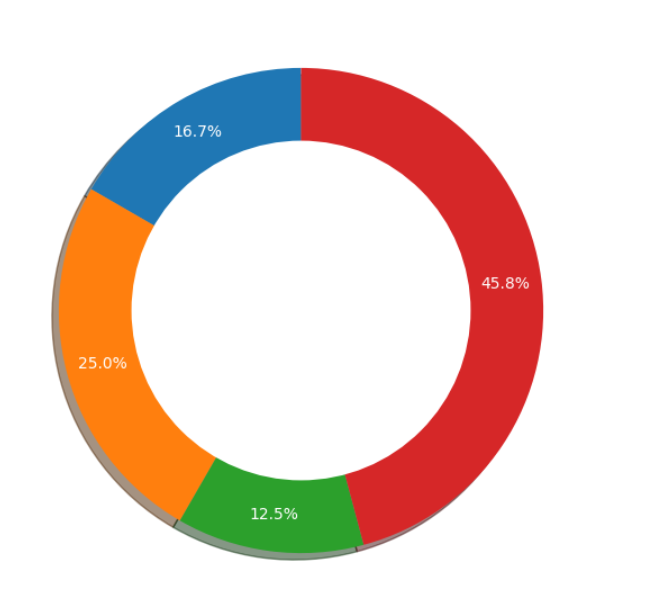
Pie Chart
- 원을 부채꼴로 분할하여 표현하는 통계 차트
- 전체를 백분율로 나타낼 때 유용하지만, 비교가 어려워 사용할거면 bar plot과 함께 사용을 권장
Donut Chart: 중간이 비어있는 Pie Chart
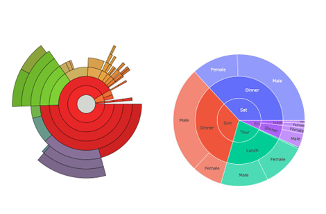
Sunburst Chart: 계층적 데이터 시각화에 사용
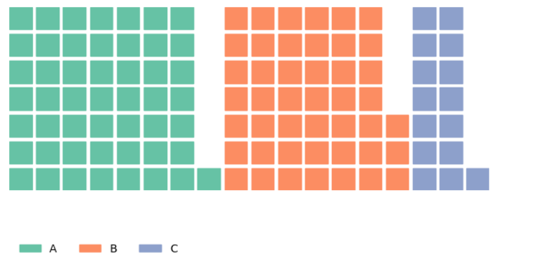
Waffle Chart
- 와플 형태로 discrete하게 값을 나타내는 차트 pywaffle 라이브러리로 구현 가능
- 아이콘을 사용한 Pictogram Chart도 가능
fig = plt.figure(
    FigureClass=Waffle,
    rows=7,
    values=data,
    legend={'loc': 'lower left', 'bbox_to_anchor': (0, -0.4), 'ncol': len(data), 'framealpha': 0},
    block_arranging_style= 'new-line',
)
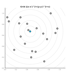
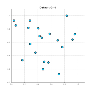
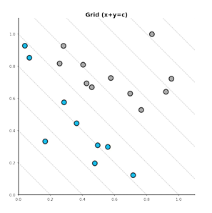
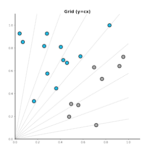
Grid 활용
기본 Grid
축과 평행한 선을 사용하여 거리 및 값 정보 제공 무채색 사용, 레이어 순서 조정 (zorder)
다양한 타입의 Grid
기본적인 Grid
Feature의 절대적 합이 중요한 경우
Feature의 비율이 중요한 경우
한 데이터에서 특정 범위의 데이터를 찾을 경우