데이터 시각화 기본
시각화의 기본 요소
마크: 점, 선, 면 등 기본 그래픽 요소
채널: 색상, 크기, 위치 등 마크를 변경할 수 있는 요소들
효율적인 시각화 원칙
Accuracy: 정확도. 데이터의 값이 정확하게표현되어야함
Discriminability: 구별 가능성. 채널 내 값에 대한 구분
Separability: 분리성. 시각적 채널간 상호작용에 대한 구분
Popout: 시각적 대비. 채널을 통한데이터구분이명확해야함
Grouping: 그룹화. 유사한 것은 그룹을통해쉽게인지가능
시각화
Figure -> 전체 그래프창 하나의 Figure에 여러 개의 서브플롯(Axes) 포함 가능 전체 그래프의 크기, 제목 설정 가능
Axes -> 데이터가 그려지는 영역 Axes 에는 개별 플롯의 제목, 축 레이블 등 수행
fig, ax = plt.subplots()
plt.show()
fig ,ax = plt.subplots(2, 2)
plt.show()
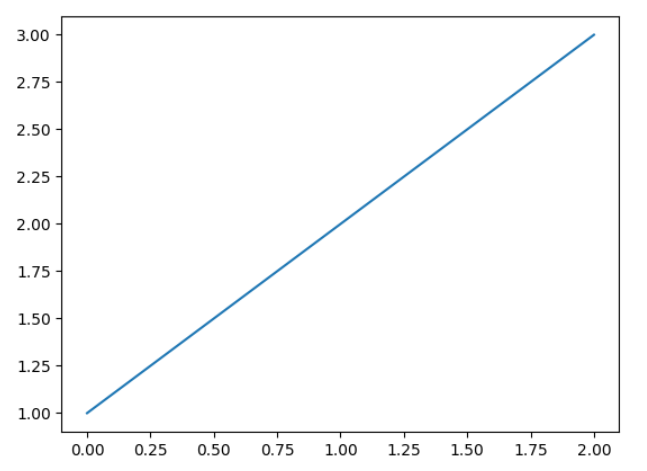
fig, ax = plt.subplots()

x = [1, 2, 3]

plt.plot(x)
plt.show()
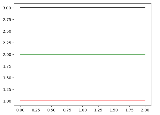
선 색 지정
fig = plt.figure()
ax = fig.add_subplot(111)

ax.plot([1, 1, 1], color='r') # 한 글자로 정하는 색상
ax.plot([2, 2, 2], color='forestgreen') # color name
ax.plot([3, 3, 3], color='#000000') # hex code (BLACK)
plt.show()
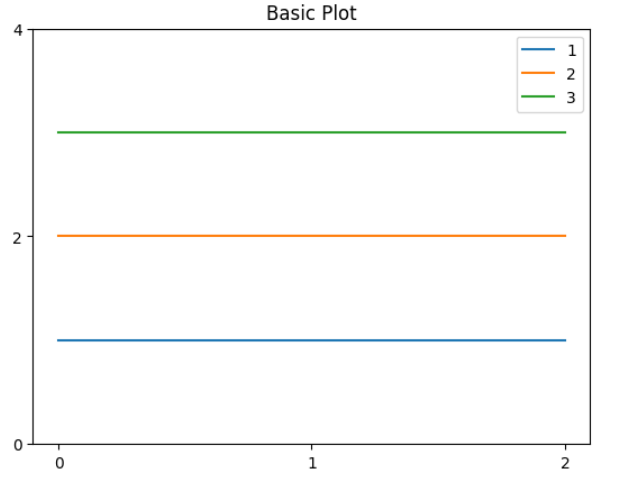
축에 적히는 수 위치 지정
ticks는 축에 적히는 수 위치 지정
fig = plt.figure()
ax = fig.add_subplot(111)

ax.plot([1, 1, 1], color='r')
ax.plot([2, 2, 2], color='forestgreen')
ax.plot([3, 3, 3], color='#000000')
ax.set_title('Basic Plot')
ax.set_xticks([0, 1, 2])
ax.set_yticks([0, 2, 4])
plt.show()
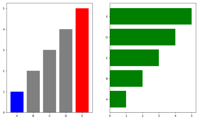
Bar Plot
fig, axes = plt.subplots(1, 2, figsize=(12, 7))

x = list('ABCDE')
y = np.array([1, 2, 3, 4, 5])

clist = ['blue', 'gray', 'gray', 'gray', 'red']
color = 'green'
axes[0].bar(x, y, color=clist)
axes[1].barh(x, y, color=color)

plt.show()
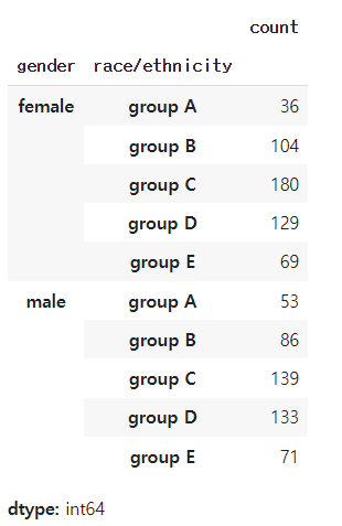
데이터 확인
group = student.groupby('gender')['race/ethnicity'].value_counts().sort_index()
display(group)
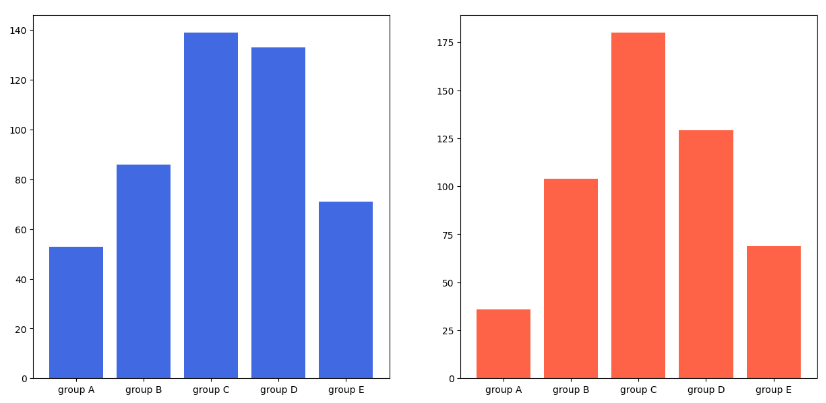
fig, axes = plt.subplots(1, 2, figsize=(15, 7))
axes[0].bar(group['male'].index, group['male'], color='royalblue')
axes[1].bar(group['female'].index, group['female'], color='tomato')
plt.show()
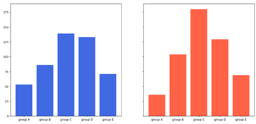
sharey=True 사용시 값에 대한 비교가 편함
fig, axes = plt.subplots(1, 2, figsize=(15, 7), sharey=True)
axes[0].bar(group['male'].index, group['male'], color='royalblue')
axes[1].bar(group['female'].index, group['female'], color='tomato')
plt.show()
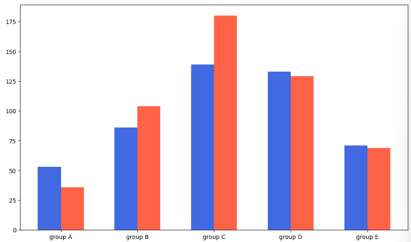
Grouped Bar Plot
width = 0.3으로 두고 왼쪽 그래프는 0-width/2, 오른쪽 그래프는 0+width/2
fig, ax = plt.subplots(1, 1, figsize=(12, 7))

idx = np.arange(len(group['male'].index))
width = 0.3

ax.bar(idx-width/2, group['male'],
       color='royalblue',
       width=width)

ax.bar(idx+width/2, group['female'],
       color='tomato',
       width=width)

ax.set_xticks(idx)
ax.set_xticklabels(group['male'].index)

plt.show()
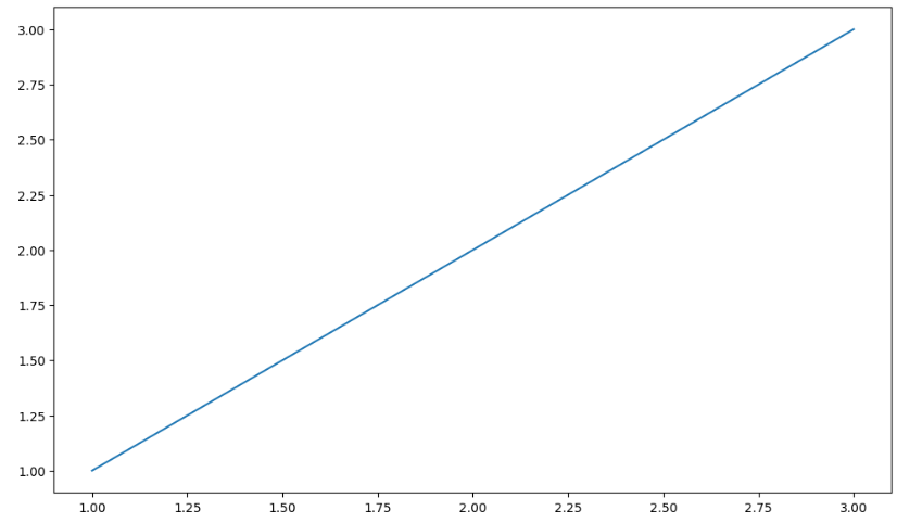
Line Plot
fig, axes = plt.subplots(figsize=(12, 7))

x = [1, 2, 3]
y = [1, 2, 3]

axes.plot(x, y)
plt.show()
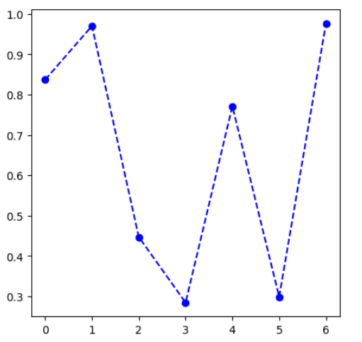
색, 마커, 선종류 변경
fig, ax = plt.subplots(figsize=(5, 5))

np.random.seed(97)
x = np.arange(7)
y = np.random.rand(7)

ax.plot(x, y,
        color='blue',
        marker='o',
        linestyle='dashed'
       )

plt.show()
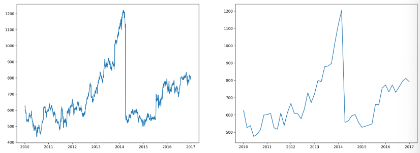
Smoothing
from scipy.interpolate import make_interp_spline, interp1d
import matplotlib.dates as dates

fig, ax = plt.subplots(1, 2, figsize=(20, 7), dpi=300)

date_np = google.index # x축 데이터
value_np = google['close'] # y축에 사용할 주식 가격 데이터

date_num = dates.date2num(date_np) # smoothing을 위해 날짜 데이터를 수치로 변경
date_num_smooth = np.linspace(date_num.min(), date_num.max(), 50) # 날짜 데이터를 50개의 포인트로 변경
spl = make_interp_spline(date_num, value_np) # 빈 부분에 대한 보간
value_np_smooth = spl(date_num_smooth) # 보간된 데이터를 바탕으로 변경된 날짜 데이터 포인트로 변경

ax[0].plot(date_np, value_np)
ax[1].plot(dates.num2date(date_num_smooth), value_np_smooth)

plt.show()
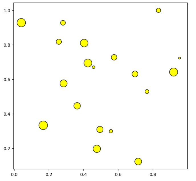
Scatter Plot
fig = plt.figure(figsize=(7, 7))
ax = fig.add_subplot(111, aspect=1)

np.random.seed(970725)

x = np.random.rand(20)
y = np.random.rand(20)
s = np.arange(20) * 20

ax.scatter(x, y,
           s= s,
           c='yellow',
           marker='o',
           linewidth=1,
           edgecolor='black')

plt.show()
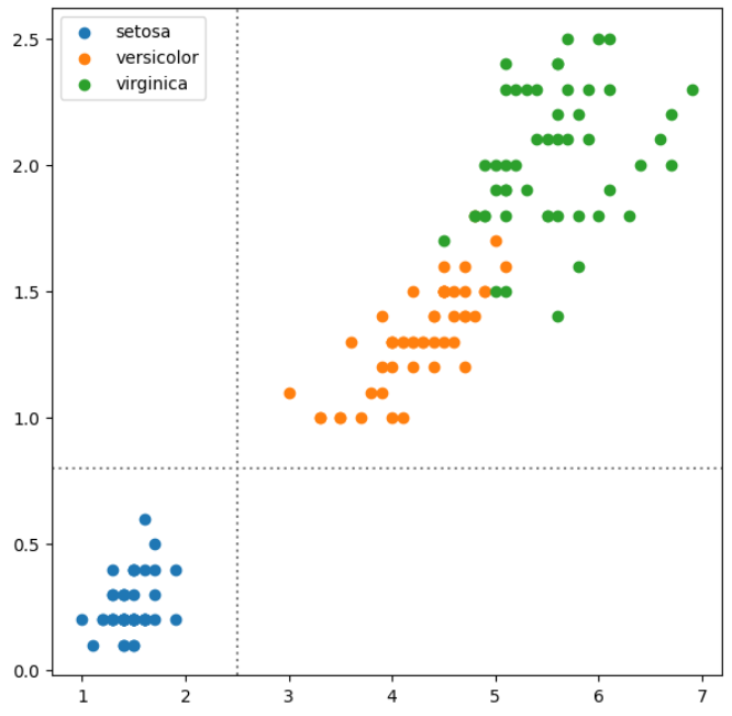
붓꽃 데이터 확인
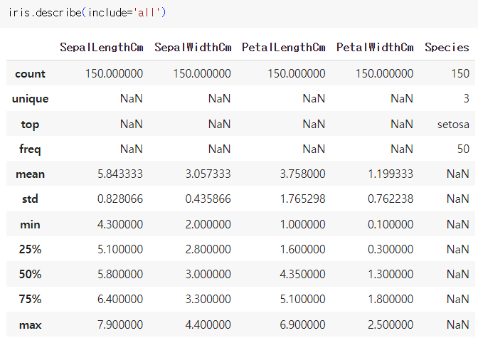
fig = plt.figure(figsize=(7, 7))
ax = fig.add_subplot(111)

for species in iris['Species'].unique():
    iris_sub = iris[iris['Species']==species]
    ax.scatter(x=iris_sub['PetalLengthCm'],
               y=iris_sub['PetalWidthCm'],
               label=species)

ax.axvline(2.5, color='gray', linestyle=':')
ax.axhline(0.8, color='gray', linestyle=':')
ax.legend()
plt.show()
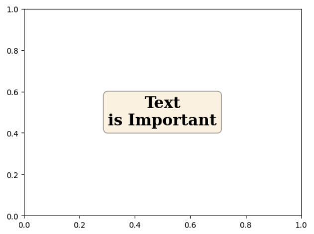
Text
fig, ax = plt.subplots()
ax.set_xlim(0, 1)
ax.set_ylim(0, 1)

ax.text(x=0.5, y=0.5, s='Text\nis Important',
        fontsize=20,
        fontweight='bold',
        fontfamily='serif',
        color='black',
        va='center', # top, bottom, center
        ha='center', # left, right, center
        rotation='horizontal', # vertical?
        bbox=dict(boxstyle='round', facecolor='wheat', alpha=0.4)
       )

plt.show()